Event Branding
SUGAR, SPICE & EVERYTHING NICE
Branding for an exhibition of adult toys.


The Exhibition
This exhibition is aimed at audiences unfamiliar with the world of adult toys. The project breaks taboos by blending humor, innocence, and cheeky sensuality to create an approachable, playful experience. The goal was to open a door for curious yet hesitant viewers through lighthearted design that feels safe, inclusive, and fun.

Logo
Since this topic and type of products is filled with stigma and misinformation, the logo was designed to be friendly and happy, welcoming and inviting for people who are not be familiar with this world and might be intimidated by it.


Typography, color & elements
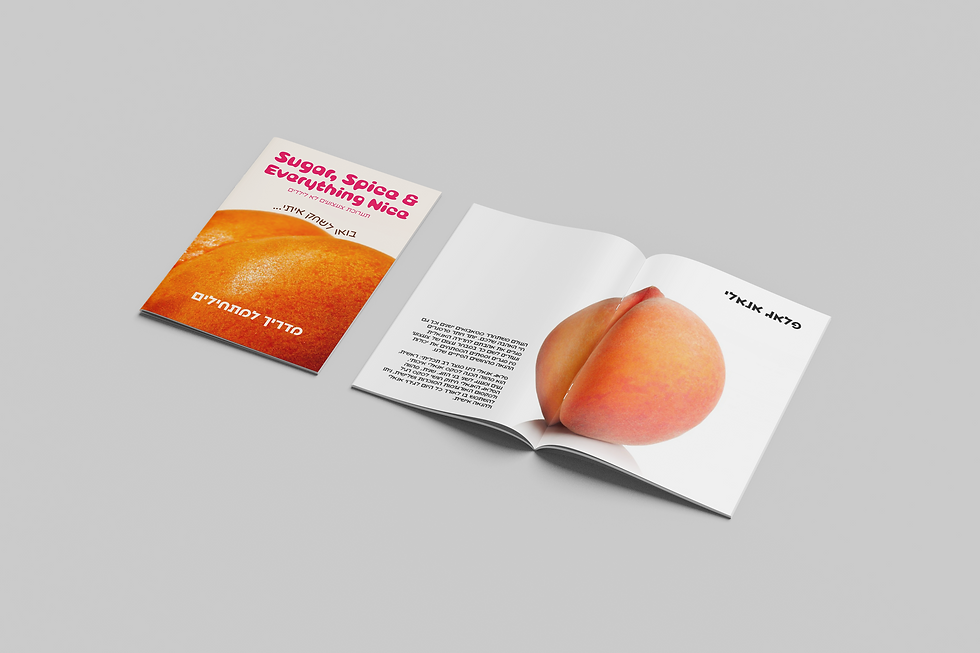
The typography used in for the logo was bubblegum in a shade of hot pink to make it bubbly, vibrant and fun.
For the text the font chosen was Anomaly, it's a smart and unique font, fits with the word and image play.
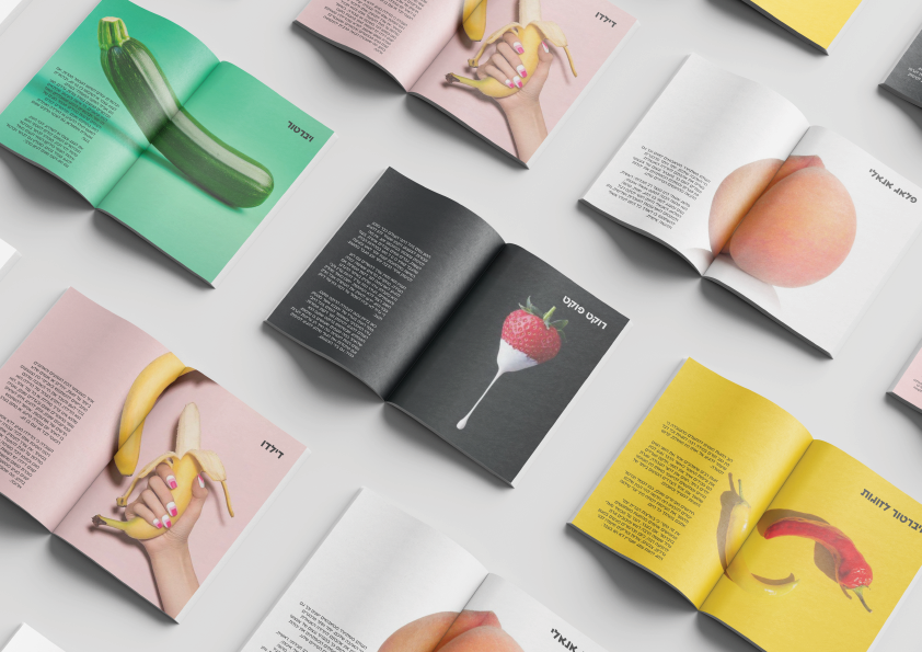
The fruit element is to hint sexuality without showing anything explicit, welcoming to all crowds (including religious people).
The colors are in the pastel palette, to compliment the color of the fruit and the logo, also adds to the lure for the people passing by the exhibition.


Approachability
The exhibition gives out to the incoming visitors a 'beginner guide' explaining about the different products.
In addition, the exhibition hands out a brochure of instructions of how to clean the products, with every purchase.